The graphic novel Mercury by Hope Larson weaves two stories together, sometimes echoing themes, sometimes building one off the other.
The synopsis from the inside cover flap: “In 1859 French Hill, Nova Scotia, Josey Fraser has just met handsome Asa Curry – a man with a mysterious and traveled past. While quickly winning young Josey’s heart, Asa reveals a secret ability to locate gold on the Fraser’s farm. But there is darkness in the woods…and in Asa.
In the same town one hundred fifty years later, Tara Fraser is dealing with the aftermath of her house burning down; a house that has been in her family – and Josey’s – for generations, when Tara discovers a pendant that turns out to be much more than a simple heirloom. As Josey’s story plunges into tragedy, Tara’s emerges with the promise of gold.”
The description sounds like a romance, but it’s much more down to Earth than that. Josey in 1859 lives with her parents on their failing farm. She's doing chores and thinking about the world beyond her house when a stranger knocks on the door. Meanwhile, in 2009 Tara is returning to French Hill High school after a year-long hiatus. Her house burned down and she and her mother had to move north to earn extra money. Tara is back in town, living with her cousin. In the next 234 pages Larson tells how the everyday lives of these two girls intersect in time.
The story grew on me as I read it, and the languid pace goes with the fluid artwork. The whimsy in the art is especially noticeable in the special effects, such as the cursive “flee” when a character runs away, or the elusive “Finish” hovering over the goal in a race.
I like the sense of place. The opening panels show a road in French Hill, Nova Scotia evolving from a forest in the 1400, through Native Americans, settlers, soldiers, farmers and suburbs to the year 2009 when we meet up with Tara jogging past the Hungry Miner Pizzeria. It feels like I could find the remains of Tara’s burned house on Google Maps. It was also fun to see how Larson compares and contrasts the lives of the two teen girls, Josey and Tara, in the same place, similar situations, years apart.
Although it was less evident at the start, the graphic novel has elements of magical realism. Larson tells the tale as if both girls live in the real world, but by the conclusion there are plot points which make us question reality: malevolent pits, ghost processions and talking crows with human faces. The occasional sparks or lines emitting from characters adds to this impression.
I also like Larson’s general spirit toward her work. She truly wants to reach the teen girl audience. At Stumptown Comics Fest 2010 panel “Comics for Young Readers”, and online on her twitter feed she talked about finding readers. It's evident in this book that she wants to deliver an honest story, not only for the teen girl audience but for everyone, while sticking with a goal of reaching young readers.
There were only a few distractions from the quality of the novel. If anything, I felt the conclusion could have been extended somewhat. I liked that Tara, as the protagonist, solved her own problems but to me it felt too pat. The redeeming feature, however, was that although magic led her to the solution, Tara had to solve the problem herself.
I was also confused by theme of mercury. Asa has a pendant filled with mercury that he uses to search for gold, and it’s also possible that Tara has a mercuric personality, but it didn’t work for me to link this to the house fire. Although the fire was the impetus for Tara moving away, and subsequently moving back as an outsider, the connection was a weak link for me. That theme was jarring to me, even though it worked well in the plot line.
In summary, Mercury is a great read. It’s an original story, and the artwork stretches comic tropes into new areas. I’d recommend it as fun for kids, teens, or adults. If you’d like to read more about Hope Larson you can visit her website www.hopelarson.com.
8/26/10

"North World: Other Sagas" by Lars Brown
According to the cover, Lars Brown’s North World: Other Sagas contains “slackers, warriors and lovelorn pizza cooks are just a few of the heroes introduced in North World: Other Sagas! Their adventures bring them above the clouds, into cursed forests, and against all manner of evils. Viking raiders, cloud giants, pink Cyclops, demon curses, tribes of angry squirrels – if swords and magic don’t work, kitten throwing just might.”
The blurb, however, doesn’t accurately describe North World, so let’s discuss the short story called “Cloud Story,” as an example. The mercenary swordswoman Nico has hitched a ride with her old friend Capt. Harker on an air-sailing ship. En route, the crew discovers a pair of gods about to have a fight, and they decide to place bets and watch the bout. Nico is so enrapt with the match that she yells loudly enough to capture the gods’ attention, and they chase the air ship. Harker manages to elude the gods, but not before Nico gives one of them a black eye with her sword. As the story closes Nico and Harker make goo-goo eyes at each other.
Likes: My teen son chose to buy this book at Stumptown Comics Fest 2010 based on the cover. After reading it his opinion of North World was it’s a “collection of funny, sort-of cool short stories.” I liked the art – cartoony without being goofy, and it’s nice that Brown can vary his art depending on the story.
Dislikes: My problem was that most of the stories followed a similar pattern: clever set-up, a frisson of love interest, some irony mixed with smashing, and a slightly funny ending. One or two of those in a collection wouldn’t be bad, but 10 in a row became monotonous. Maybe it works better as a web comic (www.north-world.com). Or, maybe I should try North World 1: The Epic of Conrad, which judging by the title promises to be a larger story.
If you’re a teen boy, or into irony, or have ever wondered what Cimmeria would be like if you swapped Conan the Barbarian for Clive the Hipster, then get Lars Brown’s North World: Other Sagas.
The blurb, however, doesn’t accurately describe North World, so let’s discuss the short story called “Cloud Story,” as an example. The mercenary swordswoman Nico has hitched a ride with her old friend Capt. Harker on an air-sailing ship. En route, the crew discovers a pair of gods about to have a fight, and they decide to place bets and watch the bout. Nico is so enrapt with the match that she yells loudly enough to capture the gods’ attention, and they chase the air ship. Harker manages to elude the gods, but not before Nico gives one of them a black eye with her sword. As the story closes Nico and Harker make goo-goo eyes at each other.
Likes: My teen son chose to buy this book at Stumptown Comics Fest 2010 based on the cover. After reading it his opinion of North World was it’s a “collection of funny, sort-of cool short stories.” I liked the art – cartoony without being goofy, and it’s nice that Brown can vary his art depending on the story.
Dislikes: My problem was that most of the stories followed a similar pattern: clever set-up, a frisson of love interest, some irony mixed with smashing, and a slightly funny ending. One or two of those in a collection wouldn’t be bad, but 10 in a row became monotonous. Maybe it works better as a web comic (www.north-world.com). Or, maybe I should try North World 1: The Epic of Conrad, which judging by the title promises to be a larger story.
If you’re a teen boy, or into irony, or have ever wondered what Cimmeria would be like if you swapped Conan the Barbarian for Clive the Hipster, then get Lars Brown’s North World: Other Sagas.
"Monster" by Naoki Urasawa
In Naoki Urasawa’s Monster, Volume 1, an ice-cold killer is on the loose, and brilliant Dr. Kenzo Tenma is the only one who can stop him! Conspiracies, serial murders, and a scathing indictment of hospital politics are all masterfully woven together in this compelling manga thriller.
Likes: Art is clean and characters are distinctive. The “camera” angles are almost cinematic… way more dynamic than a soap opera. I also like the oblique nod to Astro Boy creator Osamu Tezuka by calling the young surgeon Dr. Tenma, just like the name of Astro’s creator/father. I also appreciated the appendix explaining page-by-page the Japanese sound-effect.
Dislikes: Written in 1995, the story feels too much like a cross between “Silence of the Lambs,” (1991) and “General Hospital.” Maybe the characters evolve, but in the first volume the lead character of Dr. Tenma is too naïve to be believable, and the supporting cast of doctors are too one-dimensional. If I’m going to immerse myself in an epic manga, (18 volumes!) I’d rather invest in the quirky and unpredictable 20th Century Boys, or Urusawa’s homage to Astro Boy Pluto: urasawa x tezuka.
If you like soap operas, serial killer stories, or hospital dramas you’ll get hooked on this. Otherwise, head for the 20th Century.
8/10/10
Spotlight on Angoulême


Angoulême is a medium-sized city built on a hill in France about 50 miles from the Atlantic coast. The town has been connected with paper-making and the printing industry since the 14th century, mainly because of the moderate climate and ready source of water via the Sorgue river. More recently the town has acquired a reputation for its working artists, and I wondered if they were represented in the crowds populating the cafe terraces lining the pedestrian streets in the town center. Mostly wearing leather jackets and blue jeans, bucking the popular direction of France by smoking, they had to either be artists or rejects from a James Dean bio-pic.

In France comics are called B.D. which stands for "Bande Dessinée," or "drawn strip" in English. Franco-Belgian comics have oddly paralleled US and English comics with only a few crossovers such as Tintin
 , Asterix
 , and perhaps Lucky Luke
 . That could lead a non-Francophile to believe there's a paucity of comics in France, but comics are huge. In fact the market for the “ninth art”, as graphic novels and comic books are called in France, has been the most resistant publishing sector to the effects of the economic crisis in the 21st century.
The national Musée de la Bande Dessinée (CNBD) is a relatively new museum in Angoulême dedicated to honoring comics from many countries, although it focuses primarily on French, American, English and Japanese works, in that order. The permanent display of original and hard-to-find older specimens is interestingly laid out by country and chronologically. They also present temporary exhibitions such as "La bande dessinée animalière," showing samples of cartoon animals in 19th and 20th century comics. Across the way from the CNBD is the exposition hall with a movie theater, art gallery, and classes in art techniques and history. Entry to the museum is 6 euros, free to kids under 18 years old. Plan on spending at least an hour, although the museum also has reading tables stocked with hundreds of comics, so you may end up finding a couch and getting comfortable. Photography is forbidden, and the low lighting makes it sometimes difficult to clearly see all the details of the work, so you might be tempted to purchase the museum's catalog at 60 euros, available in the gift shop. In fact, I spent nearly as much time browsing the shop as in the museum itself.


Aside from the museum, Angoulême does its best to represent comics throughout the town. I spotted comic book references everywhere: Wonder Woman and Spider-man promoting scooter-delivered pizza, a Chinese restaurant blatantly exploiting Tintin's "The Blue Lotus

 ", and a painting of Winsor McKay and Little Nemo
 under a bronze plaque of la Republique Francaise. In the courtyard of the comic museum was a statue of the Italian comic book sailor, Corto Maltese
 , while near the center of town was a building called Espace Franquin. Apparently a public media center, it's named after the creator of the French comics Gaston and Marsupilami.

The Centre National de la Bande Dessinée et de l'Image can be found at 121 rue de Bordeaux, 16023 Angoulême. Here's an article from 2009, just before the museum opened.
The Angoulême International Comics Festival has been held in January every year since 1974. Here is a blog entry about the 2009 festival.


8/6/10


Duckworld Located
GraphJam has posted the "Geek Solar System" and it's nice to see Duckworld on there. It makes sense that Donald Duck's Disney universe is in an orbit close to Melmac, Ork and Fhloston Paradise. I wonder if Howard the Duck and Donald Duck are warring clans from opposite sides of the Duckworld?
This sort of graphic gets me in the same was as mapping out comic book buildings and worlds.
 Click here to give justice to the image in its entirety.
This sort of graphic gets me in the same was as mapping out comic book buildings and worlds.

6/3/10
Dick Briefer's Frankenstein #9
Dick Briefer's Frankenstein comic has an odd history. It originally started in Prize Comics #7 (1940) as "America's first ongoing comic book series to fall squarely within the horror genre." (Don Markstein). But in 1945 the series was moved to a comic of its own, Frankenstein also by Prize Publishing, and Briefer turned him into a comical but eerie lunk, sort of a precursor to Herman Munster.
As Wikipedia says: "like many returning veterans, Frankenstein settled into small-town life, becoming a genial neighbor who began having delightful adventures with Dracula, the Wolfman and other horrific creatures."
It's hard to understand what made Briefer turn to humor, maybe a desire to lighten up after the oppression of WWII, but the humorous Frankenstein ran until issue #18 in 1952, when it reverted to the original horror format. That only lasted two more years, probably folding due to the unpleasant spotlight shed on horror comics by Frederic Wertham and his book "Seduction of the Innocent."
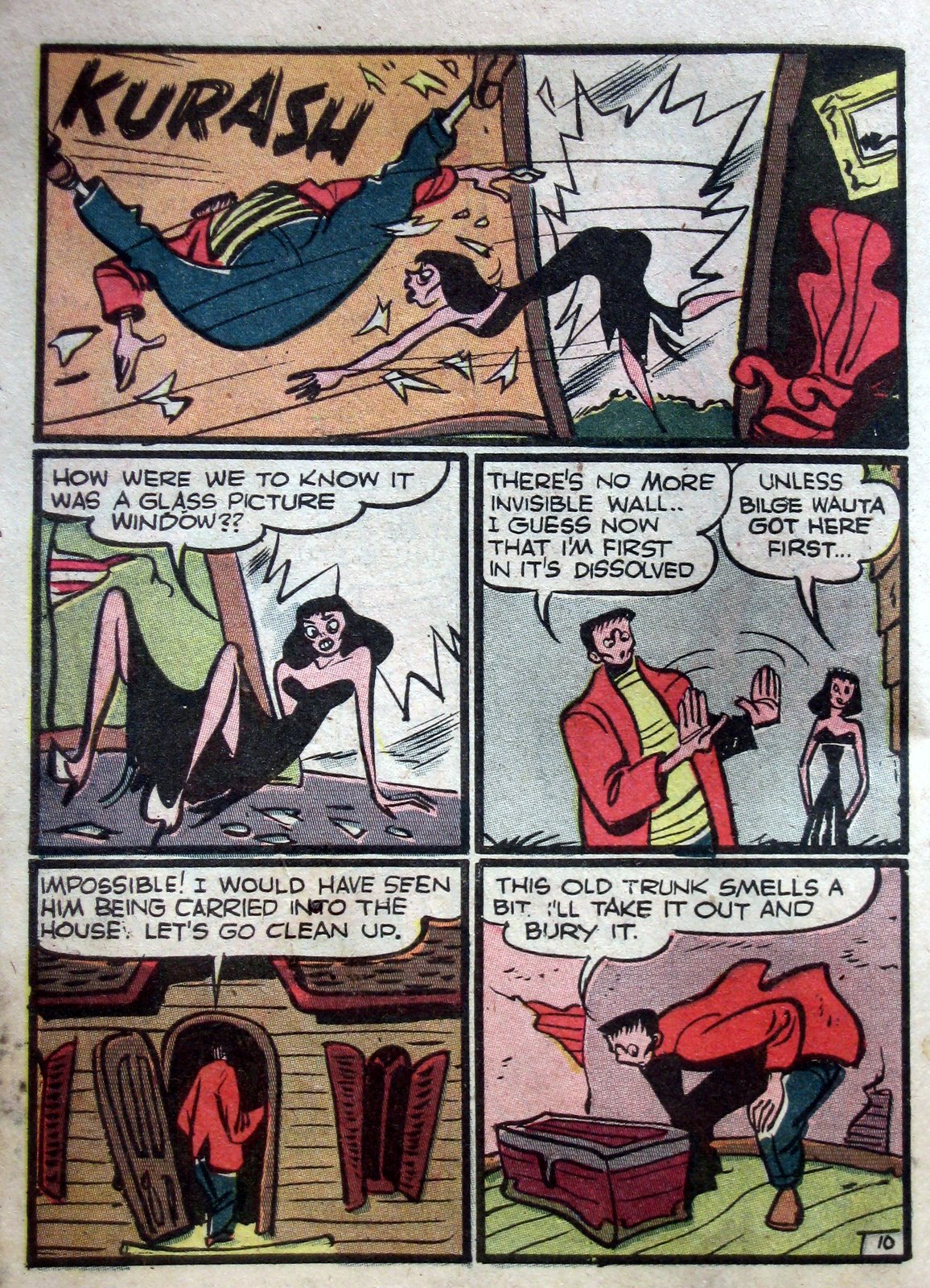
In Frankenstein #9 from 1947 several of the stories center around the housing shortage, which many of the veterans experienced after World War II. The first story, "Frankenstein and the Invisible Wall," begins with the witch Sessy Poole challenging Frankenstein and Bilge Wauta to a contest. Whoever enters a house first will win the house. "If you were to buy this same house today the price, tremendously inflated, would be $420," she explains. The two contestants run for the house only to discover it's surrounded by an invisible wall. Bilge Wauta stalks off to figure out how to break through the invisible wall, while Frankenstein continues to try to go over, under, or through. Meanwhile Sessy Poole makes a prediction about the winner.
Frankenstein is about to give up when two delivery men show up. They can pass through the invisible wall without any problems. Confused, Frankie heads home... The story takes an odd jump at this point, starting with the caption "Two years later Frankenstein tells the story to Veronica Honika." You can read the rest for yourself.
When I first read this story as a kid I assumed Bilge Wauta was a recurring character in the Frankenstein stable. Seeing it as an adult I get a different perspective. In any case, Briefer does a good job of making the story humorous while also retaining some eerie aspects of the Frankenstein world.


![Reblog this post [with Zemanta]](https://lh3.googleusercontent.com/blogger_img_proxy/AEn0k_vyU4UMUBXLPGIaPHFDsZu2TenM8K_vf7RwRF_lXk90Tp8GyQvX8KD3JALI08vqUhFHMcMbzAfCEGEnuBt_JapBobnytYfY9dYmG_P5CPs8Azx0MkquUZFDyxX4LgJNyF-L6zkZ7X8sBiZeQ3nhZSMz=s0-d)
As Wikipedia says: "like many returning veterans, Frankenstein settled into small-town life, becoming a genial neighbor who began having delightful adventures with Dracula, the Wolfman and other horrific creatures."
It's hard to understand what made Briefer turn to humor, maybe a desire to lighten up after the oppression of WWII, but the humorous Frankenstein ran until issue #18 in 1952, when it reverted to the original horror format. That only lasted two more years, probably folding due to the unpleasant spotlight shed on horror comics by Frederic Wertham and his book "Seduction of the Innocent."
In Frankenstein #9 from 1947 several of the stories center around the housing shortage, which many of the veterans experienced after World War II. The first story, "Frankenstein and the Invisible Wall," begins with the witch Sessy Poole challenging Frankenstein and Bilge Wauta to a contest. Whoever enters a house first will win the house. "If you were to buy this same house today the price, tremendously inflated, would be $420," she explains. The two contestants run for the house only to discover it's surrounded by an invisible wall. Bilge Wauta stalks off to figure out how to break through the invisible wall, while Frankenstein continues to try to go over, under, or through. Meanwhile Sessy Poole makes a prediction about the winner.
Frankenstein is about to give up when two delivery men show up. They can pass through the invisible wall without any problems. Confused, Frankie heads home... The story takes an odd jump at this point, starting with the caption "Two years later Frankenstein tells the story to Veronica Honika." You can read the rest for yourself.
When I first read this story as a kid I assumed Bilge Wauta was a recurring character in the Frankenstein stable. Seeing it as an adult I get a different perspective. In any case, Briefer does a good job of making the story humorous while also retaining some eerie aspects of the Frankenstein world.




5/20/10
Stumptown Comics Fest: Spotlight on Paul Pope

Pope looked like a rock guitarist on his day off: shaggy hair, black jacket, faded blue jeans. His demeanor echoed the spirit of Jim Morrison, whom he cited as one of his early influences. Despite the bad boy aura, Pope was prepared with a professional PowerPoint presentation, and proceeded to deconstruct his art with the precision of a surgeon.
Pope claims that his overarching goals are to bring non-comic subjects into his body of work, and to take the tenets of pop art seriously. He was drawn to the medium because he loved the cheap, mass-produced quality of comics, but he also wants to stretch the art form, and talked about "covering" previous artists in the way musicians cover songs.
His original influences came from two men in his life: his father's rock 'n roll record collection, and his uncle's comic collection. From there he began to explore offshoots: Little Nemo, Heavy Metal Magazine, the work of Moebius especially his "Airtight Garage," and other "sinister" European art. He also mentioned the manga artist Tadanori Yokoo. Then to top it off he mentioned the Sunday comics of Milt Caniff and the music of Ludwig Van Beethoven. At one point said he had a desire to cover Omac "in the style of Andrei Rublev." I'm not sure if he meant the painter, or in the style of the film by Andrei Tarkovsky of the painter's life.
With each reference I became more intrigued by this artist, and I was still reeling when he began a dissection of his efforts on Batman Year 100. "Imagine Batman as a corporate brand," he suggested, "how does one face lift...tweak an icon?". Let me tell you, if you're Paul Pope it's a very thoughtful process.
Pope tried to distill the essence of Batman, and in his mind the bat silhouette is the brand. Throughout the world, even if people don't read comics, they recognize the bat shadow and oval for Batman. The other facet of the character is the city, which Pope called The Batman's "signature." As protector of the city, there's no reason for a Batman without the city. He also thought the flapping cape suggested a flying flag.

Moving past the cover, Pope wanted the first scene in Batman Year 100 to encapsulate the story, just as the opening bars of Beethoven's Fifth Symphony are repeated throughout the music. He lifted the bike scene from George Lucas's THX 1138, because those motorcycles were so ominous and fast. Also he wanted to incorporate the "bat in the man," giving Batman an animal totem beyond the normal Batman in the comics. So, he came up with the custom mouth guard, looking like vampire teeth.
By the end of the presentation Pope had run through a litany of influences that seemed more dreamlike and expressionist than concrete. Although I hadn't paid much attention to Paul Pope, I liked his reinvention of Adam Strange for Wednesday Comics. His presentation at Stumpfest made me want to (re-)read all of his earlier work.

Some other points touched on during the Q&A session:
- Sam Hiti's "Death Day"
- act-i-vate comics web site
- Luis Bunuel's autobiography "My Last Sigh"
- The death (and dearth) of anthology publications like Heavy Metal, and how web comic sites like act-i-vate might replace them.
- How pinball tables influenced the symmetrical layout of Adam Strange in Wednesday Comics
- How his computer workspace is physically lower than his drawing space -- so the computer knows who's in charge.
- His work with Michael Chabon on the film version of Kavalier & Klay, which is on permanent hiatus
Pope also briefly spoke about his newest work, Battling Boy, the son of a god who comes down from a mountain at his father’s behest to rid a giant city of monsters. The work is his way to find some wish fulfillment and it looks like it has a lot of extended fight scenes.
You can get more insight into Paul Pope on his blog, or through his flickr stream.

![Reblog this post [with Zemanta]](https://lh3.googleusercontent.com/blogger_img_proxy/AEn0k_tMyl4ERxLu5M-ljYApb-asjEwqSRqL_G5_IOpGX4ZMCxVu6V8_8Tq-7DNQYttYcUlcu3Ic7kIg9-Q65ntA5XbBPUVzJQqpqy65y2Ud7vHBmVUuSmnRokAAXlS9ETK55y0Do8eJlnl9LXNlbWxRncP6=s0-d)
Subscribe to:
Posts (Atom)