1/23/11

"Breaking Free" by J. Daniels - Contraband Tintin

This year Steven Spielberg is producing a studio version of Tintin that will be released the world over and will finally bring to the silver screen the story of the boy reporter from Belgium who has had so many exciting adventures.  But, what if Tintin hadn't been born in Belgium, and had lived in a slightly different time, would his life have followed the same path?  What if Tintin came of age in England during the Thatcher era of the 1980's when unemployment reached as high as 12%.  That's not exactly the premise for "The Adventures of Tintin: Breaking Free," but that's the setting for this unauthorized version of a Tintin story.

In "Breaking Free" Tintin lives in London with his uncle Captain Haddock, and spends his time either on the dole, or slaving away at menial construction jobs.  In the same environment that gave birth to the nihilist punk movement and the Sex Pistols singing about "no future," Tintin and his mates drink at the pub, go to football games, and generally complain about their economic plight.  Tintin's sort of a lout, but maybe that's understandable given the environment. The rambling plot has time to touch on the rise of Neo-Nazis in England, emerging gay rights issues, and concerns about gentrification before it focuses on how workers can make their grievances heard in the workplace by banding together and striking.

From there, the summary of the plot as Wikipedia puts it:


The workers become increasingly militant, turning to violent tactics and eventually firebombing the original building site. The strike begins to spread to other areas of the country without any official union involvement. Panicked, the UK government deals with strikers with increasing violence and repression, demonstrations turn into riots, and the Captain is arrested on false charges of conspiracy. As the story closes, there is a demonstration of half a million people in the town in which the events of the book unfold, several people have brought rifles and references are made to "strike committees" taking power in other areas of the country, the army being sent into Liverpool to "restore order," and similar unrest taking place around the world. The last page features the Captain, Tintin and the Captain's Wife Mary in silhouette. Tintin holds an assault rifle above his head, while the others raise their fists. Below is written: "This Is Not The End / Only the beginning…"
Obviously, this isn't the sort of story Hergé would have written, let alone agreed to associate with Tintin.  Much of the art looks like it's made by tracing actual Tintin characters into the story.  The first page is pretty shaky, and the drawing doesn't improve over the next 170 pages, but it's a dedicated effort.  In true anarchist/collective mentality no single artist gets credit for the work, mentioning only that the book is done by "Attack! International."  Contrasting this book with the Hergé Tintin stories where one or two characters save the day, the point of this story is that only through the solidarity of the workers can change be effected.


When I first found this comic in 1989 or 1990 I read it in one standing in the aisle at Powell's bookstore. Although it reads quickly, at 170 pages I must have stood there for about an hour.  I'm always interested to see comic icons re-purposed and reinvented, and this was only a couple years after Frank Miller had invigorated Batman with his miniseries "The Dark Knight Returns", so the idea of putting existing characters into new and unusual situations was very novel to me.  Using the Tintin cast in this political tract allows readers to identify with known characters, and brings them into the story very quickly, even if it's a different environment. This would be especially true for Europeans who had grown up with Tintin comics.  But it also sheds a pale light of reality, making the normally optimistic and industrious boy reporter into an everyday sullen teen, who doesn't want to work, but that's the only way to make money.

The copy I have is from 1989 and cost 2 UK pounds.  Since then it seems that there's been a reissue with a new cover.  You can also read the entire book (minus the cover) online.  One thing's for sure, Spielberg isn't going to turn this Tintin story into a movie.

Enhanced by Zemanta

1/1/11

Some 2010 Comic Event Highlights

Happy New Year. Here are some photos and notes from some of the comic-book events I attended in 2010.

In January  I managed to catch the last day of the show "Faster Than a Speeding Bullet: The Art of the Superhero" at the Jordan Schnitzer Museum in Eugene.  This amazing show featured original comic artwork from the 40's to the present day.   Seeing original art gives you the chance to appreciate how comics are put together and revised during the creation process, as well as an opportunity to admire the artistry of the creators in a context-free setting. Also, I especially liked being able to read an entire issue of Spider-Man as rendered by Steve Ditko.


In March I geeked out at the Emerald City Comic Con. Caught talks by legends such as Leonard Nimoy and Stan Lee, and chatted with Brian Michael Bendis and Aaron Douglas.  Meeting Hal Sutherland, who helped start Filmation and create Star Trek: The Animated Series was especially meaningful to me, since I'd watched the show as a kid.


April brought rain, and also the Stumptown Comics Fest, where I got to see Mr. Bendis again on a panel about teaching comics. I also listened enthralled to Paul Pope on his treatise on re-branding Batman, heard from Craig Thompson about his work in progress "Habibi," and browsed the lush ecosystem of independent comics.


In May the Pearl Room was packed at Powell's as Daniel Clowes introduced his new book "Wilson" to the Portland audience. "Wilson" is a darkly humorous graphic novel told in seventy five six-panel strips.  Clowes was generous enough to talk with each person who stood in line, and also hailed his favorite book of the year "Wally Gropius" by Tim Hensley.


You had to get there early in July when Atomic Arts present "The Space Seed" episode of their series Trek in the Park.  It's not every day you get to sweat through a live fight sequence of Captain Kirk in hand-to-hand combat with the superman Khan.  Next summer they plan to stage "Mirror, Mirror."


True to form, I waited until September and the the last day of R. Crumb's Genesis show at the Portland Art Museum to see it. Although I've seen the book and read excerpts, it was stunning to see the original work laid end-to-end through the halls of the museum.  It gives a new meaning to a work of biblical proportion.


Speaking of inspiring works, in October I was fortunate enough to hear Lynda Barry on her tour promoting her book "Picture This: The Nearsighted Monkey Book."  During her talk she not only gave a spiel that encompassed her philosophy of "image" and how drawing or expressing your image is a therapeutic biological change that occurs in your body and makes you say "ah!", but she also started the evening by singing a song, and finished with a dirty joke she heard from her 70-year-old neighbor.  In the course of the talk she admitted her admiration for Bil Keane (she broke out weeping when meeting him in person for the first time), and during the signing generously made enough time to talk with each and every person who attended the talk.

Enhanced by Zemanta

Influence of Harold Gray on Chester Brown's "Louis Riel"

I recently read Chester Brown's amazing graphic novel "Louis Riel," about the man who fought for the rights of the Metis people during the Western expansion of Canada in the nineteenth century. The story is epic, and the clean artwork gives you a feeling of watching a historical movie.

In the foreward Brown mentions
"several people have asked me if Hergé influenced the artwork in Louis Riel. I love Hergé -- his Tintin books have probably affected my drawing-style to some degree -- but my main visual inspiration here was Harold Gray's work on Little Orphan Annie. I hesitate to acknowledge this because I'm well aware that my scratchings fall far short of the beauty of Gray's imagery."

I have to say that while I was reading the book I found many visual echoes of Gray's style, but rather than being distracting it enhanced the work. Like "Louis Riel", the Annie story lines focus on personal responsibility, pitching in with help when it's needed, and fighting for the underdog. The Tintin stories have some of these aspects, but he isn't usually the underdog in a fight.

Curiously, my son thought Louis Riel looked a lot like the Tintin artwork. I figured this was because he hadn't read "Little Orphan Annie," especially the earlier stories. So, here's a comparison of some panels from Chester Brown's work "Louis Riel," and some 1941 Sunday panels from Harold Gray's "Little Orphan Annie." (One more unintended similarity: their names are both colors.)

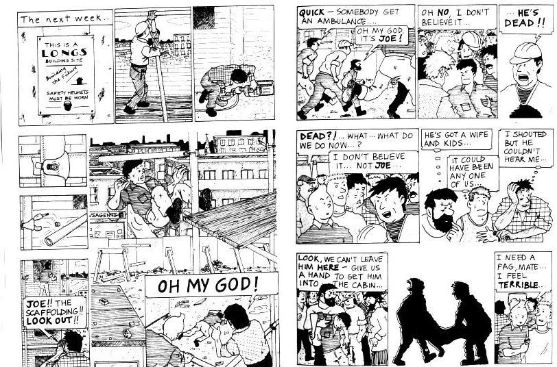
Both Gray and Brown use a lot of Chiaroscuro and cross-hatching to emphasize the characters. In the Sunday comics "Annie" was in color, while it ran in black and white in the dailies. Nevertheless, in the panel below you can see in this excerpt that the color is almost monotone with an emphasis on dark and light. Also, compare the way both artists use the dark and light. In Brown's case Riel is literally in the dark, wondering whether the Canadian government will provide amnesty for the Metis freedom fighters, while the priest is enlightened. In Annie's case, she stays in the dark as an observer while the war profiteer gets a poke in the nose from a father whose one son was killed at Pearl Harbor, and the other is fighting with the Rangers. Gray shines the light on justice served -- the war shouldn't be about making money. Contrast this with Tintin, which rarely uses crosshatching.


In a number of places Brown uses a solid black background both to imply space, but also to give a feeling of solitude or isolation. Riel's trial, for example, takes up most of the fourth act of the book and is entirely set in a solid black background. Brown mentions this in his notes: "The black backgrounds that I've used here might give the impression of a spacious room. The court-room was actually very tiny and very crowded." But, the way it's framed gives a feeling of Riel standing alone against the law process of the Canadian government.


Gray uses the black background in a similar way. The doctor has done all he can for Annie and even his medicine is no longer working for her. He's cut off from helping her through her pneumonia, and it's up to Annie now to survive on her own.

Hergé, by contrast, only occasionally uses a black background, and that is usually in the context of a night sky, or if the lights are out.

All three artists have a similar style in drawing their characters. Gray's empty eyeballs are slightly larger than those of Brown or Hergé. I'd have to say Brown's noses are drawn more like the characters in "Little Orphan Annie" than Tintin. Hergé usually keeps his people anatomically proportional, barely stretching the natural shapes of the human body. Both Gray and Brown, however, distort their characters, giving them massive girths, stretched faces, and imposing hands.


And finally, the most compelling comparison between the two artists is their consistent use of two-point perspective. The camera angle, raised to a slightly aerial position and to the left, not only gives a documentary feel to the art, but also seems to suggest a higher moral view. Hergé often used the two-point perspective, but his camera is usually level with the characters, bringing the reader into the story as if it were a newsreel. When Brown raises the camera to this aerial view it somehow manages to be both omniscient, and to say to the reader: "look, this is what's happening. Can you believe it?" It's as if he's removing us from the action to give us a chance to judge the characters.


Enhanced by Zemanta